

Hello beautiful ladies,
Okay, we’ve probably all seen this palette swatched and reviewed a thousand times by now so why am I doing another one? Well, I wasn’t sure if I was going to bother for that reason but its such a hyped product that I thought, I’d give my honest opinion without buying into the hype. I have a love/hate relationship with the Rose Gold palette so I wanted to know if this was going to be the same.
-
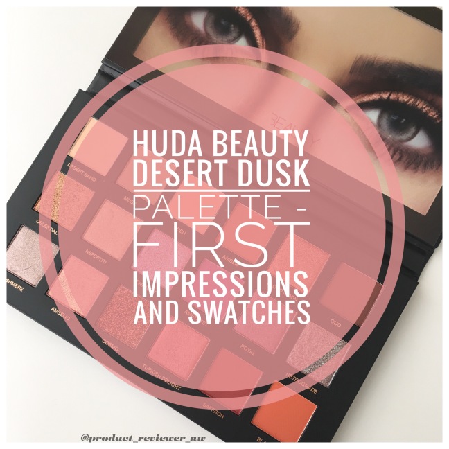
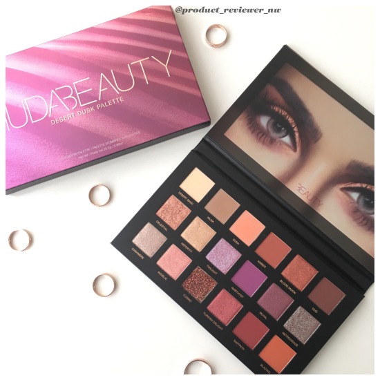
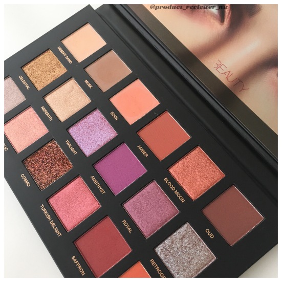
HUDA BEAUTY Desert Dusk Eyeshadow Palette
-
RRP – $95 AUD from www.sephora.com.au
First Impressions: Damn, this is expensive, especially after my experience with the Rose Gold. I then picked it up with 20% off at Sephora for $76 which is still on the pricier side but a little easier to accept. The matte shades in this palette (apart from amethyst) look similar to other palettes I have to be honest but the duo chromes and shimmers are quite unique on first look.
My other first thought about this palette was that it looked more like shades I’d wear in autumn and winter rather than summer which is what we are in in Australia at the moment. In our heat, I’m just not a fan of a lot of eye makeup, especially shimmers and glitters that tend to be rubbed off as I wipe the sweat off my face. I could be wrong and may be able to work with it for summer once I try it out but that was my immediate impression after I opened it.
So, what about the packaging? The front has a gorgeous picture of Huda’s eyes with a jewel head dress and inside is a clear protector with the eyes that I actually use to hide the mirror in photos. Its made of a sturdy cardboard, with a mirror inside and compared to the Rose Gold, is heavier and looks classier. I remember being a bit disappointed in the Rose Gold packaging considering the price. The magnetic close on this palette is stronger than some of my cheaper palettes but I still probably wouldn’t risk travelling with it.
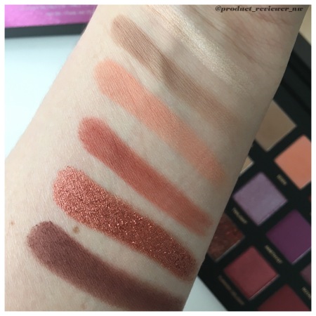
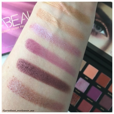
Please note that swatches are one swipe (except the glitter shade, Cosmo) with my finger in natural light and the last photo was taken when the sun decided to shine while it was partly cloudy with the first two.
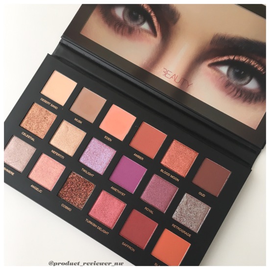
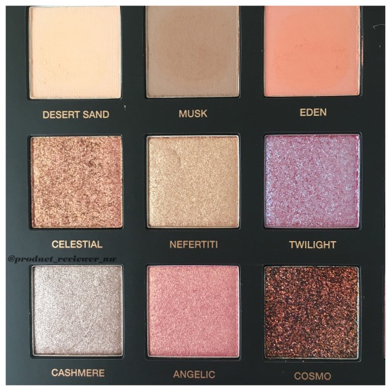
From top to Bottom:
Desert Sand: matte peachy vanilla, similar to Full Zip from Colourpop (in the Yes, Please palette) but with a slight peach undertone and there is a tiny amount of shimmer through it.
Musk: matte neutral taupe. This is the standard base shade in a lot of palettes.
Eden: matte medium peach that is slightly darker than Champs from Yes, Please.
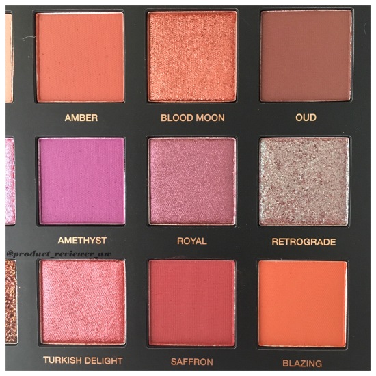
Amber: matte medium red/brown with a tiny amount of shimmer through it.
Blood Moon: the first wow for this palette is a copper metallic with a golden undertone that’s similar to Bling in Yes, Please but more metallic and more golden than Dirty Talk from Urban Decays’ Heat palette.
Oud: a matte mahogany/brown that has a tiny amount of shimmer through it as well.
From top to bottom:
Celestial: this is a duo-chrome topper that looks rose gold in the pan but swatched, looked more pink/gold. It is chunkier than it appears in the swatch.
Nefertiti: a warm light gold shimmer that is quite dry and flaked while I was swatching.
Twilight: the second duo-chrome topper is this beautiful blue/lavender that isn’t as chunky as Celestial. As I moved my arm in different directions, the shade sometimes appeared to have a pinky undertone. It looks gorgeous on my arm so I hope it translates to my eyes.
Amethyst: matte medium violet that looks patchy in the swatches and even when I tested it again, it looked very sheer which is disappointing considering I was expecting the same pigmentation as the pan.
Royal: dark plum/brown metallic that is very pigmented. The total opposite of amethyst.
Retrograde: the last duo-chrome topper is a plum/brown with blue and violet shifts. It isn’t quite as chunky as celestial but chunkier than twilight.

From top to bottom:
Cashmere: a medium taupe shimmer. It looks neutral but with a pretty metallic twist.
Angelic: a golden pink shimmer. This shade appears in both the Desert Dusk and Rose Gold palettes but swatched side by side the one in the Desert Dusk is slightly pinker than the Rose Gold.
Cosmo: this is a coppery brown pure glitter that took more than one finger swipe to build up to that shade. It is supposed to be applied with a stiff brush on the eyelid or as a liner with a liner brush but to be honest, I can’t see how its going to stay on without glitter glue. I’ll keep you posted on that one.
Turkish Delight: a medium berry shimmer with gold undertones that is only slightly lighter than Fling from Rose Gold.
Saffron: a dark mahogany red that applied a bit patchy and on second swatch, looked very sheer.
Blazing: matte burnt orange that is slightly darker than Big Cocktails from the Yes, Please palette.
Overall, there are a few shades similar to the Yes, Please palette and a couple of double ups from the Rose Gold but with the purple and plum shades added in, its quite unique. Now, is it worth $95 and is it going to end up in the love/hate relationship basket like Rose Gold?
What do you think of this palette?
My other social media accounts:
Pinterest…….Instagram…….Twitter
Until next time,
Nyobie


Beautiful swatches! I really loved your descriptions of each shade!! I haven’t swatched mine yet since I still have to take photos. I feel like this palette might be a bit challenging to use but I plan on looking up some tutorials since I’m such a beginner with eyeshadow!
LikeLiked by 1 person
I found the Rose Gold a bit of a challenge. It is time consuming to creat a look but it does create beautiful looks. I just don’t use Rose Gold enough because I don’t always have a lot of time.
I’ll be creating some looks with this Palette this month and reviewing it fully. Thank you so much for taking the time to read it 😘
LikeLike
I can’t wait to see what you come up with!
LikeLiked by 1 person
Thank you ☺️I’ll try to come up with a variety of easy to elaborate looks 🙌
LikeLiked by 1 person
This palette gave me the same feeling as Rose Gold – some of the shades look very pretty while some just make me wary (those pure glitter shades) and overall for the price I just wasn’t going to go there. Good thing you got it on sale! I think if it came up in a sale I would consider it but otherwise I’m happy without this one. Beautiful swatches/photos/writing as always 💜💜
LikeLiked by 1 person
I totally understand your reasoning for not getting it. Even on special it’s quite expensive, though worth it if I could use it as much as the MR or Sweet Peach palette. I’ll be doing some looks with it this month and hopefully that will be up early next month.
Thank you so much for taking the time to read my post 😘
LikeLike
I love the colors of this palette!! Thanks for sharing babe
LikeLiked by 1 person
Thanks for reading it lovely 😊
LikeLike
This palette is stunning 😍
LikeLiked by 1 person
I agree and it’s so beautiful to photograph 😍
LikeLiked by 1 person
Stunning colors!. Thank you for the great review.
LikeLiked by 1 person
Thank you for reading my post 😊
LikeLiked by 1 person
I feel like Huda always kills it with her packaging. They’re always so cute and gorgeous! But I do feel her products are more on the pricy side. The palette looks beautiful, but I’m just not a purple kind of girl. I like 2/3 of the palette, but for such a high price I want to love the entire thing. Your swatches look great btw ❤
LikeLiked by 1 person
You are right – if you’re not going to use everything in this Palette, it becomes too expensive. I’m glad you loved the swatches too 🙌
LikeLike
I’ve been wanting to have this since it has launched! But the price though 😦
LikeLiked by 1 person
Yes, it’s definitely pricey and that’s why I wanted to review it because if it’s not worth it, I want to let people know. The full review and some looks using it should be up early next month. Thanks for reading my post 😊
LikeLiked by 1 person
Perfect well-rounded review love it
LikeLiked by 1 person
Thank you so much for appreciating it ☺️
LikeLike
I have seen this palette everywhere and all praises. But the price is too much when I don’t wear eyeshadows that often. I will get the UD Heat, ColorPop, Morphe instead of this one hehehe. 🙂
LikeLiked by 1 person
I do agree – the price is a big setback for many people. I wanted to do a first Impressions before a full review just to swatch it for anyone considering it in the Black Friday sales.
I’m going to see how versatile it really is with some makeup looks and whether I think it’s worth the price tag in a post coming soon. I’ve also reviewed the Heat palette and created some looks with that one. Thank you for reading my posts 😀
LikeLike
The shades look really beautiful! I’m now thinking of getting the small palettes, because I don’t really need the big one 🙂
LikeLike
Amazing review!! I’m really loving the shimmer shades on this palette because the swatches look amazing. Thank you so much for the little descriptions about it because sometimes pictures don’t make the underlying tones obvious and you’ve described them very well!!
I’ve reviewed the Huda Beauty Warm Brown Obsessions palette which I think you’d enjoy!! Feel free to check it out and tell me what you think about it!!
LikeLiked by 1 person
Thank you for reading my post ☺️ I’ll check out your review as I haven’t bought that palette yet.
LikeLiked by 1 person