


Hello beautiful ladies,
The Kat Von D Pastel Goth palette originally didn’t appeal to me at all. I mean, if I’m honest those colours are just way too much colour for me. However, I bought the Metal Matte a few months ago and I’ve been surprised by the versatility I’ve been able to get out of it. I haven’t used every colour in that palette yet but I decided to give the Pastel Goth another look in.
-
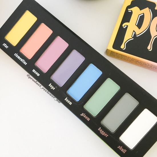
KAT VON D Pastel Goth Eyeshadow Palette
-
RRP – $60AUD from Sephora buy it here
Why? I ordered it for completing one of my goals last month and even when it arrived, and I saw it in real life, I wasn’t impressed. It just didn’t talk to me. Maybe I’m not a pastel girl after all.
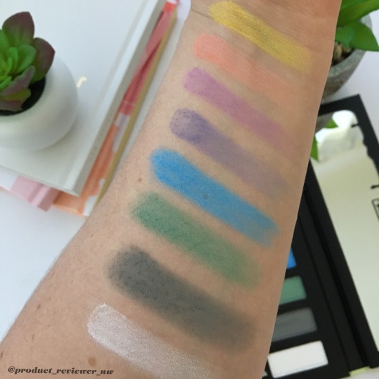
First Impressions: Most pastels are quite sheer so when I first opened it, I was a bit terrified of all that colour – bright colour. So I swatched them (please note these swatches are actually built up quite a bit because my one swipe finger swatch didn’t show up enough.) My initial thought was that they are still very bright but after thinking about it, I wouldn’t put the whole palette on my eyes at once. I could very well use each of the colours separately with other more neutral bases.
The pigmentation is still pretty impressive considering how notoriously difficult matte shadows can be and combining that with pastel shades.
I must admit that it was only after swatching this palette that I was able to think outside the box and beyond the aaahhh….bright colours meltdown that was going on in that box. I am now quite excited to try some of these shades out to see if they really are as wearable as I’m hoping.
 From top to bottom:
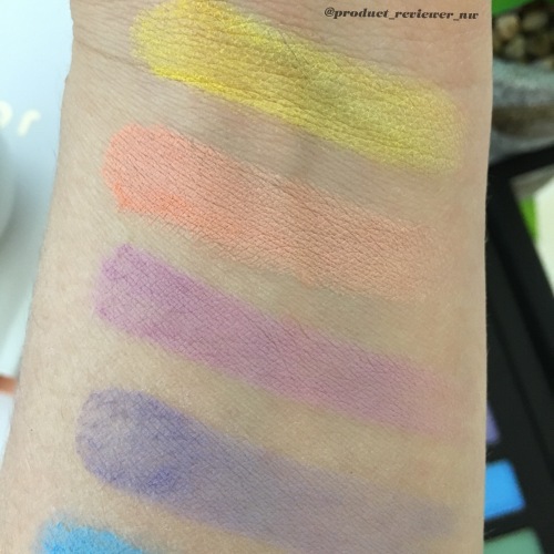
Star: This is a bright yellow that I think would look good with oranges and deep reds in a sunset themed eye look. The Smashbox Ablaze comes to mind as the companion to this shade.
Clementine: This is a gorgeous pastel peach. It is quite sheer so it can be used subtly or built up. The Too Faced Sweet peach was my first thought and it does compliment the shades in that palette.
Meow: This colour reminds me of lavender and is still quite sheer too. It swatched slightly patchy but I don’t think it would be a problem applying it. I think this shade would fit in with the Kat Von D Chrysalis palette.
Dope: This colour is very patchy – I swatched it a few different times and each time, it was quite patchy although very pigmented so I’m hoping its not going to be hard to work with on my eyes. This would fit in with the Chrysalis palette too.
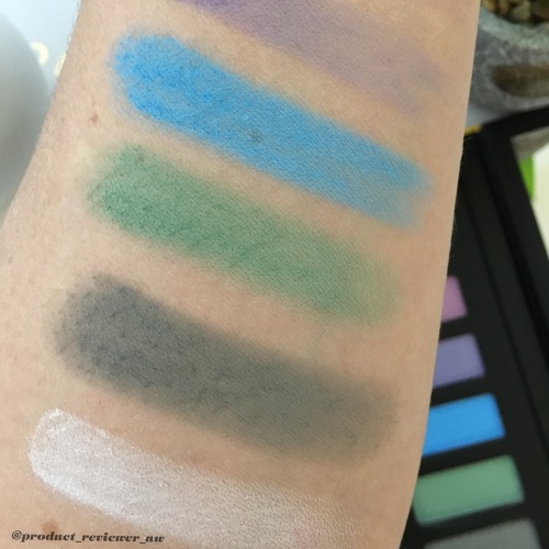
Doom: This is a very pigmented sky blue. This colour had me lost for how I’d use it but I think in a grey/silver smoky eye and add this for a pop of colour. The Urban Decay Naked Smoky eyeshadow palette comes to mind.
Gloom: This is a gorgeous muted green but quite sheer to begin with. If you’ve been following me for awhile, you’ll know I love a brown/green smoky eye so this shade would go with any neutral palette for that but lets just say the Kat Von D Shade & Light to keep with naming options.
Dagger: Slightly patchy gun metal grey. You could use it with any of the pastel shades here to be honest or as a transition in a shimmery dark grey/black smoky eye. The Kat Von D Better Together eyeshadow palette comes to mind.
Skull: Smooth pure white that can be used as a base for any colour to really intensify the colour. Suitable to use with any palette but can you imagine the intensity of the Ablaze look I described earlier with this?
I’m going to try a few of these colours in some different looks so I can show you all whether a) its not wearable for most people or b) it looks awesome and doesn’t look as terrifying as I thought.
Do you own this palette? What are your thoughts?
My other social media accounts:
Until next time,
Nyobie


I love everything KatVonD but I’m a wimp with overly coloured palettes, especially pastels but I think it’s bc I wear black grey and white mostly. My adrogony palette was a step outside the box for me.. And still edging up to try the powerful colours.. Love to hear how you go with your out of the box purchase too ☺️
LikeLiked by 1 person
I’m exactly the same or was about 12 months ago and then I bought the Contraband by Urban Decay with its colour shimmers and loved it with a brown Smoky. So I’ve been branching out a lot more lately – believe me, this is still my scariest looking purchase though 😂 the Androgyny palette is a beautiful palette to start with though 😍 Thanks for reading 😊
LikeLiked by 1 person
I love the safe colours but I do love trying new things and practising so I can get nice looks with a difference. Androngony is a safe start and then I’ll try juvias place and go crazy 😂😂
LikeLiked by 1 person
Oh yes, Juvia’s are great palettes – they can be safe, a little different or way ott. The postage is quite expensive so I’d try to get all the ones you may want in one order. Or even if you have friends who may want one or two. The Saharan is one of my favourite palettes for a mix.
LikeLiked by 1 person
I don’t have one friend anywhere interested in makeup like me .. if only I could share postage with a buddy
LikeLiked by 1 person
I’m in the same situation – most of my friends don’t even bother with makeup let alone be interested in Eyeshadow palettes from a brand they wouldn’t have heard of. It’s a shame we’re not closer 🙄
LikeLiked by 1 person
I need a friend like you too, close by and romantic outings to Mecca or sephora 😍😍 my friends don’t have more than one of anything and gasp.. one foundation 🙈🙈
LikeLiked by 1 person
I could imagine I’d be dangerous in Sephora (I don’t have one close) but it would be exciting to go shopping with a friend.
I’ve got the exact same type of friends – some don’t even have Foundation 😱
LikeLiked by 1 person
Thankfully I need to make a trip to the city for sephora , so I don’t get there often.. plus my family lose it if I start teetering around the entrance.. it’s a solo visit unfortunately.. yes it would be dangerous if we went together 😬
LikeLiked by 1 person
That’s the same when I want to go to Mecca for me – solo visit or I get nagged to hurry up 😬
LikeLike
I cannot wait to see these looks! I’m all for bright and funky eyeliner and lipstick, but haven’t quite got to the eyeshadow stage yet! xx
https://brookeclarke.blog
LikeLiked by 1 person
It’s only recently I’ve been into the brighter colours to be honest. I used to be neutral all the time but I was getting bored so I’ve branched out a bit more. I hope to do a blog post on the looks I create next month 🤗
LikeLiked by 1 person
Ill be sure to look out for them!! x
LikeLiked by 1 person
Only the yellow shade looks kind of appealing to me. They look pretty in the palette but swatched are a bit dull. I’d love to see how it looks in a make up look though x
LikeLiked by 1 person
I agree they didn’t swatch as well as I had thought they would but I also think that will make them a bit more wearable too. I hope to create a few looks for a blog post next month using this Palette 🤗
LikeLiked by 1 person
I love those purple shades! I’m scared of colour too but I recently did a blue/green look with the Androgyny palette and got heaps of compliments! Good luck with the looks, I can’t wait to see them! ❤️
LikeLiked by 1 person
That would’ve looked lovely 😊 I’m yet to use the blues in the Androgyny palette but I will get to it 🙌
LikeLike